top of page


Brand Identity
Desarc
For Desarc, we revitalized the brand identity while preserving the existing logo and fonts. The inspiration for this concept comes from Desarc's philosophy: “We collaboratively define the conceptual foundations of the design, providing a solid base we can always rely on throughout the design process.”
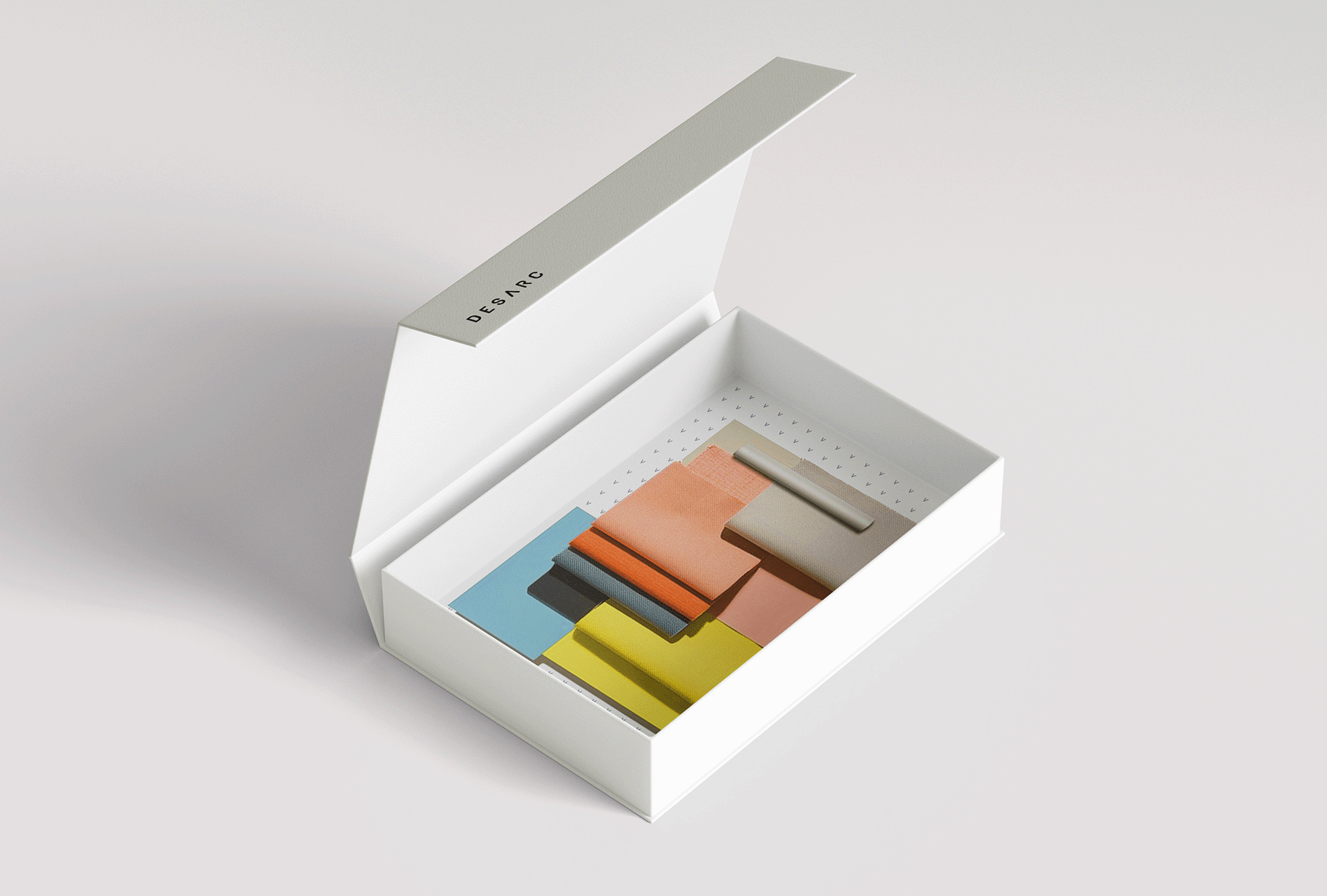
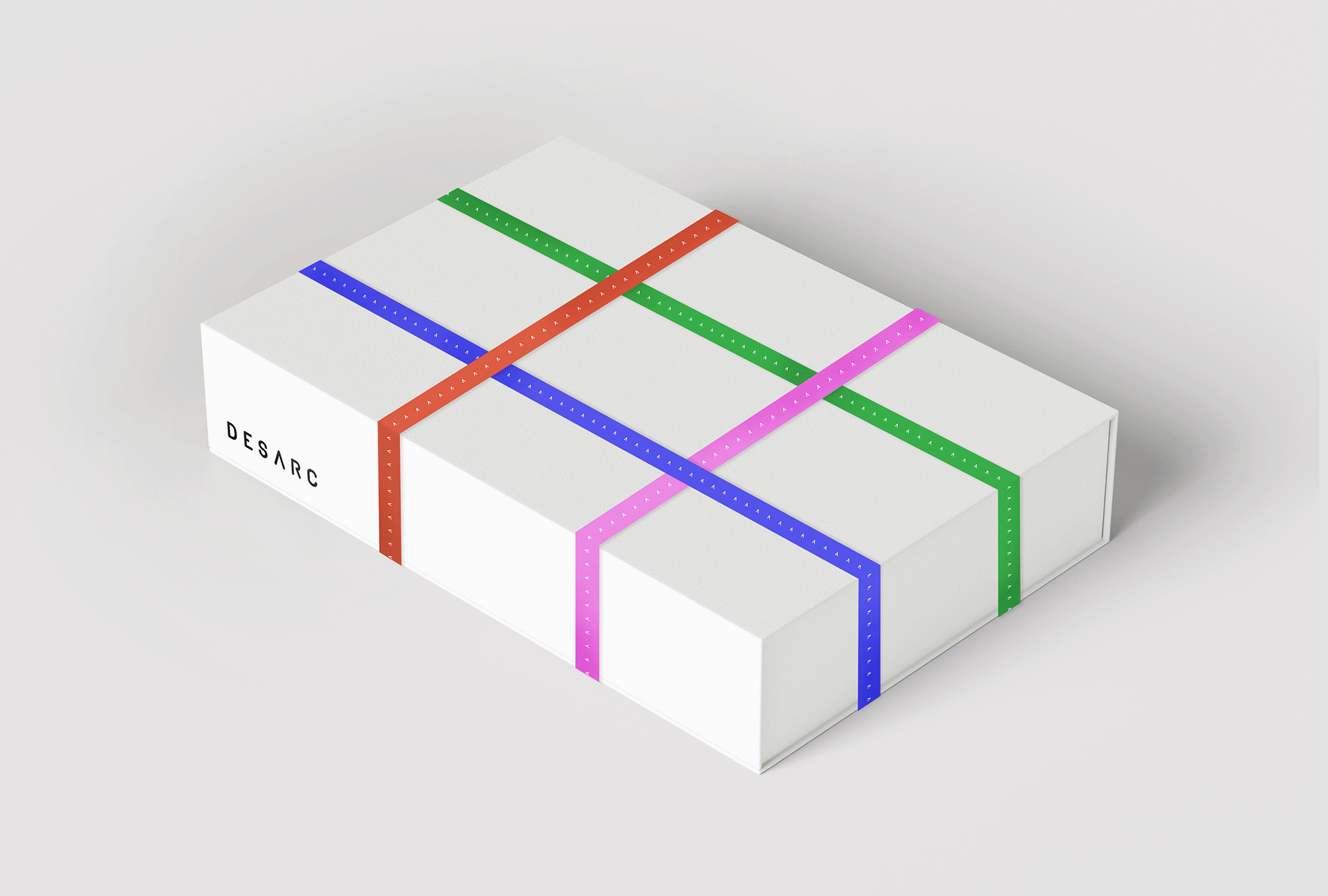
The “A” in Desarc’s logo became the foundation of the visual identity, represented as an arrow. This arrow symbolizes Desarc providing direction and forms a grid—a blank canvas that can be filled with creativity. Within this grid, arrows can be rotated to create shapes, representing the creative group at Desarc who approach things from
a unique perspective.
Project
Identity
Date
2024
For
Desarc


bottom of page